


The Snarky Tea Packaging Redesign focused on maintaining the bold and playful personality of Snarky Tea while introducing a fresher, more modern aesthetic.
Key updates include:
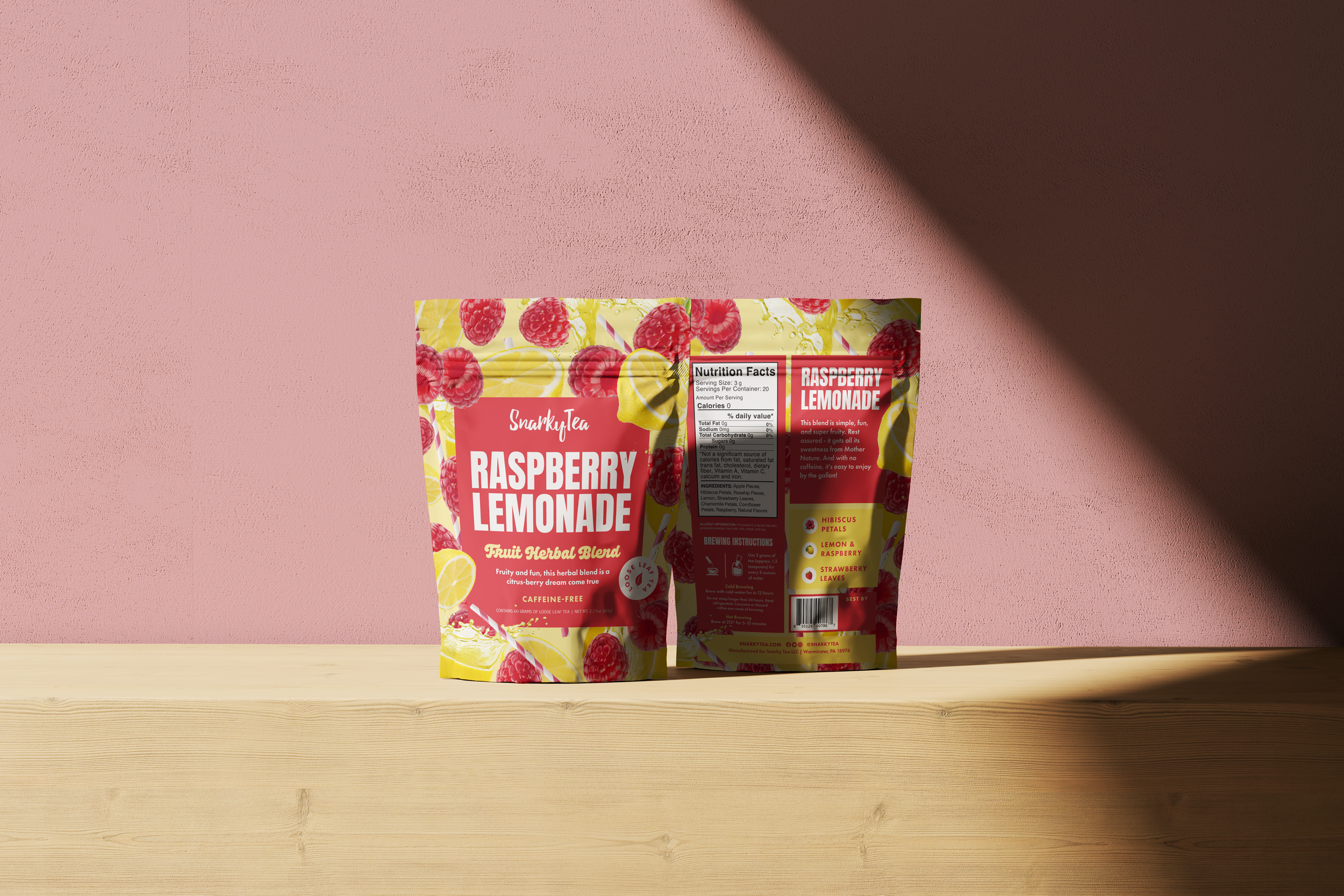
• Enhanced product visibility through the use of brighter, natural elements that highlight the tea’s ingredients like goji berries and melon slices.
• A more structured layout for nutritional and brewing information, improving readability and overall user experience.
• A clean, organic color palette with a refreshed typeface that aligns with the playful yet premium brand identity.