Objective
Support promotional campaigns and product launches through mobile-first creative designed to drive engagement and sales across email and social placements.
Scope
• Promotional email campaigns
• Paid and organic social graphics
• Homepage hero and site banners
• Product launch assets
• Seasonal sale campaigns
Approach
Focused on clear hierarchy, urgency cues, and high-contrast messaging to ensure quick readability on mobile. Designed promotional systems that could scale across multiple placements while maintaining brand consistency.
Impact
Contributed to high-volume campaign rollouts supporting seasonal promotions and new product launches within a fast-paced retail environment.
Objective
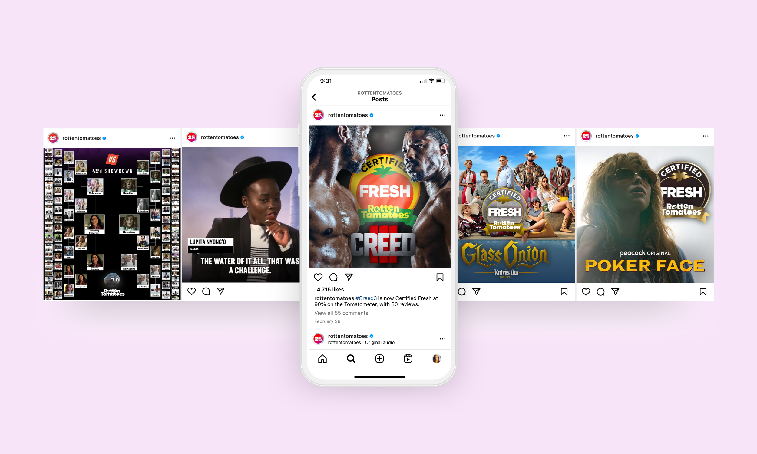
Increase engagement and clarity across high-volume social content while maintaining strict brand recognition standards for a globally recognized entertainment platform.
Scope
• Certified Fresh graphic system
• Vertical TikTok “First Reviews” template
• Campaign-specific social graphics (film releases, bracket campaigns)
• Legacy template refresh for improved engagement
Approach
Designed thumb-stopping, mobile-first creative optimized for quick readability in scroll environments. Strengthened visual hierarchy to emphasize Tomatometer scores and key messaging while building modular templates for scalable social output.
Impact
Delivered refreshed social systems used across high-engagement posts reaching millions of followers.
Objective
Drive product launch revenue and subscription sign-ups through mobile-first, conversion-focused email campaigns.
Scope
• Seasonal product launch emails
• Limited-batch promotions
• Subscription (“Tea of the Month”) campaign assets
• Promotional CTA design
Approach
Structured emails using clear hierarchy and urgency cues to guide readers from hook to product highlight to call-to-action. Designed responsive, mobile-first layouts optimized for quick scroll behavior and high CTA visibility.
Impact
Supported limited-edition launches and subscription campaigns through high-clarity promotional messaging and consistent brand execution.
Objective
Support audience growth, engagement, and sponsored campaigns through cohesive digital design systems across web, social, and educational products.
Scope
• Sponsored content campaigns
• Landing pages and downloadable guides
• Social media template systems
• E-course branding and promotional assets
Approach
Built modular visual systems to maintain consistency across high-volume content while prioritizing clear hierarchy and conversion pathways (newsletter sign-ups, downloads, event registrations).
Impact
Supported brand partnerships and audience engagement initiatives through scalable digital campaign design.
Objective
Improve product clarity and shelf visibility by refining layout structure and strengthening flavor differentiation across SKUs.
Scope
• Packaging layout redesign
• Typography system refinement
• Information hierarchy restructuring
• Cross-SKU visual consistency
Approach
Simplified information architecture to reduce cognitive load and improve scanability in both retail and e-commerce environments. Standardized layout systems to create a cohesive, scalable packaging framework.
Impact
Delivered a unified packaging system that enhances readability and strengthens brand recognition across product lines.
VS SHOW REDESIGN
VS is a show from Rotten Tomatoes that compares and contrasts various actors, directors, and films based on both individual and box office records available on YouTube and Xumo. Work includes: logo redesign, key art design, and full GFX package including lower thirds, mortice, stat screens, photo screens and motion direction.
ROTTEN TOMATOES 25TH ANNIVERSARY
Created visual identity for the 25th anniversary of Rotten Tomatoes, which was implemented across site, editorial and social assets.
This project involved designing the full visual and interface system for Daily Tomato, a mobile game experience from concept through prototype.
I developed the logo, wireframes, and interface design to create a cohesive visual language that felt intuitive, engaging, and easy to navigate across screens. Layout structure, typography, and interaction flow were carefully considered to support both usability and brand personality.
The result is a unified product experience that balances clarity, playfulness, and functional design across the entire app.
Play the game here!